Episode 001: Astartes
A Black Templars Project and some test models
Introduction
This is the story of how I set out to paint some Warhammer Fantasy Chaos Warriors and ended up starting a Black Templars collection. The crux of this hobby diary entry is how important nostalgia and a sense of connection to what I’m painting is important to me.
As mentioned on the Introduction page, this site is actually the third iteration of my hobby diary (the first being some random word documents, the second a physical journal). When I moved to Luxembourg a just under two months ago I started to write in a physical book again, since I find it more relaxing than typing, but have since switched to this digital version. After finally getting into painting some test models (below), I wrote a piece of lore in support of an idea for a Blood Angels Successor homebrew chapter (The Lunar Sanguinomancers) and outlined some information about my painting process. At the end of writing, I also made a physical note to myself that while I really liked the rules for the Blood Angels, they weren’t really a chapter I had any real connection to.
After a bit of musing and soul-searching, I realised I had a chance to do a project that melded both my old and new views on Space Marines in a way that was simultaneously “nostalgia fix” and “new beginnings”, which is exactly what I want.
Scratching the itch to paint Space Marines
After so long away from any form of painting I was expecting to dive into my Warhammer Fantasy Chaos Army. I have some really cool old metal miniatures to work on and absolutely loved the 6th edition Chaos knights I’d painted previously, who I thought looked sinister and glorious in their black metal armour (that’s foreshadowing, FYI). But when I did set up my models what I really felt like painting was something involving stippling. I really enjoy the rough, textured look it creates and it’s an enjoyable process. Somehow I decided this would be best applied to Space Marine armour, and from my bag of Astartes bits I assembled the bodies of nine marines: three assault intercessors, two infiltrators, and four intercessors.
The test models
Salamander


First up was a test model for the Salamanders, wet blending and stippling a dark green (Army Painter Hardened Carapace), lighter green (Necrotic Flesh) and yellow (Desert Yellow), with black shoulder pads (Contrast Black Templar). I’m somewhat happy with the result, though before I completely finished I realised that the colour scheme just doesn’t pop enough. It’s essentially drab green, rather than vibrant, and unlike the previous test model I’d done for Salamanders with oil over metallics, it didn’t excite me.
Lunar Sanguinomancer
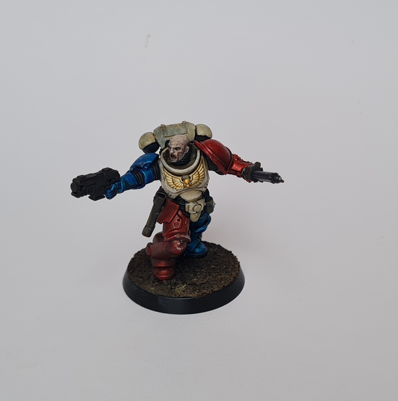
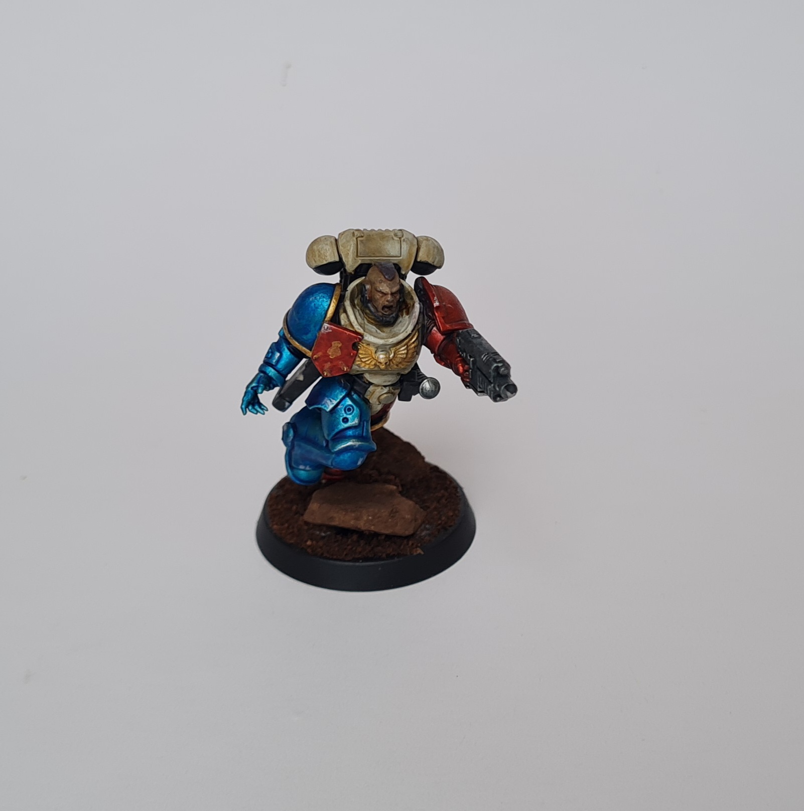
The second test was something I’d wanted to emulate for awhile, Migsula’s Blood Angels in metallic red. I didn’t want to just copy this scheme exactly, and going through my saved Astartes images on Instagram I found two pieces of art depicting a decidedly French marine in metallic red and blue armour split down the middle, but with the torso painted a pale, rich cream. The look was very Crusader, very Chivilrous, and I liked the noble, knightly aesthetic. I painted this with a base (stippled) of Army Painter Hardened Carapace (because I’m now in an apartment and can’t use a rattlecan), then stippled True Brass and Shining Silver as a type of zenithal base coat. Over this I applied Contrast Blood Angels Red and Contrast Talassar Blue. The bare headed marines were painted with a general skin mix - layers of diluted Contrast Skeleton Horde, Guilliman Flesh, and heavily diluted Shysh Purple, sometimes alternating with highlights of diluted Citadel Ulthuan Grey. The torso was painted with layers of Ulthuan Grey and coats of Skeleton Horde. For one of the marines, and then after these photos the other two, I applied a final layer of Ulthuan Grey to make the torse sections clearly ‘white’ instead of ‘dirty cream’. Looking at the photos, I think I actually prefer dirty cream.
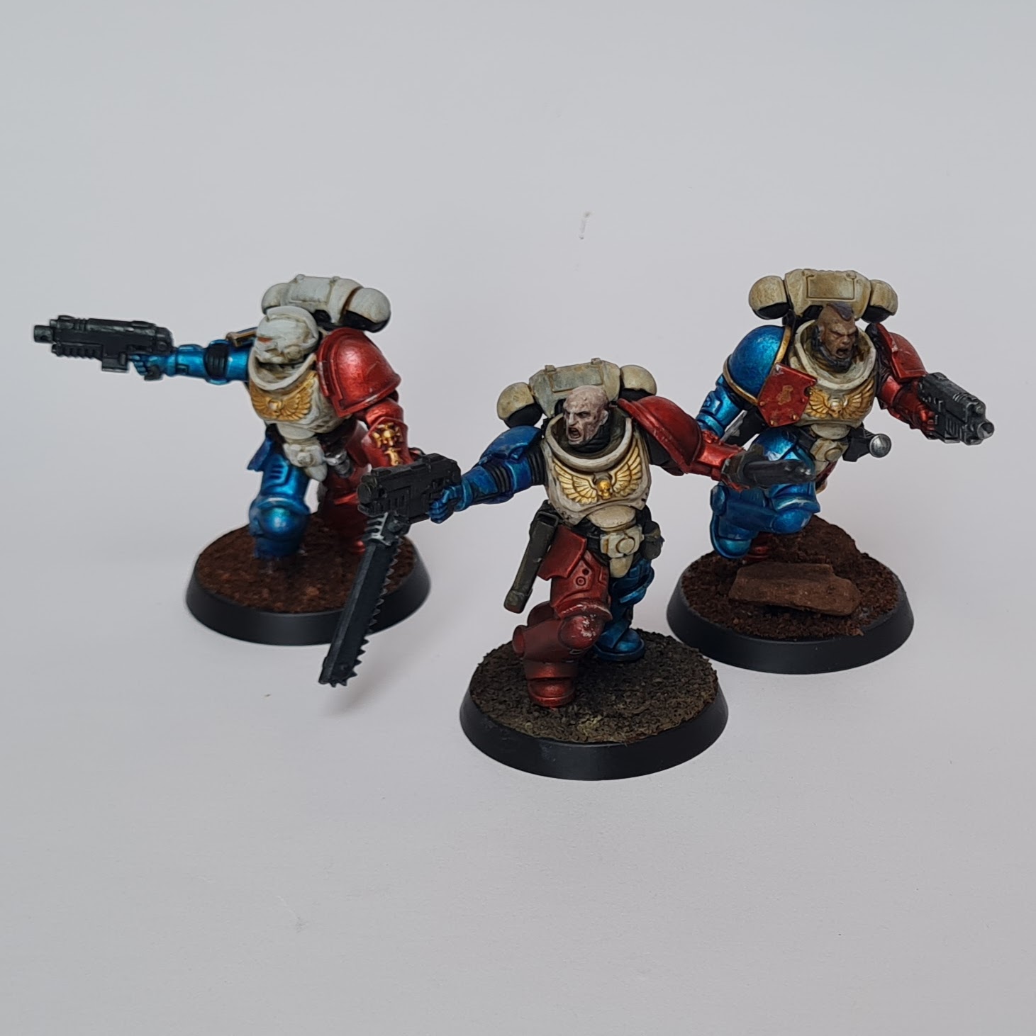
I like these models. The blue really pops, the red pops, I’m reasonably happy with the interaction between the metallics and the contrast. But somewhere it falls over for me - it’s not quite what I had in mind compared with the original artwork and I don’t feel that it captures the noble, knightly aspect I wanted. By this stage I’d written the lore piece for the Lunar Sanguinomancers (which I did enjoy and might pick back up again one day), and written about what I really wanted my Astartes to look like, and I just wasn’t feeling like this was something I wanted to take further. Great fun, really enjoyed the test models, happy to leave it as is.
Blood Angel
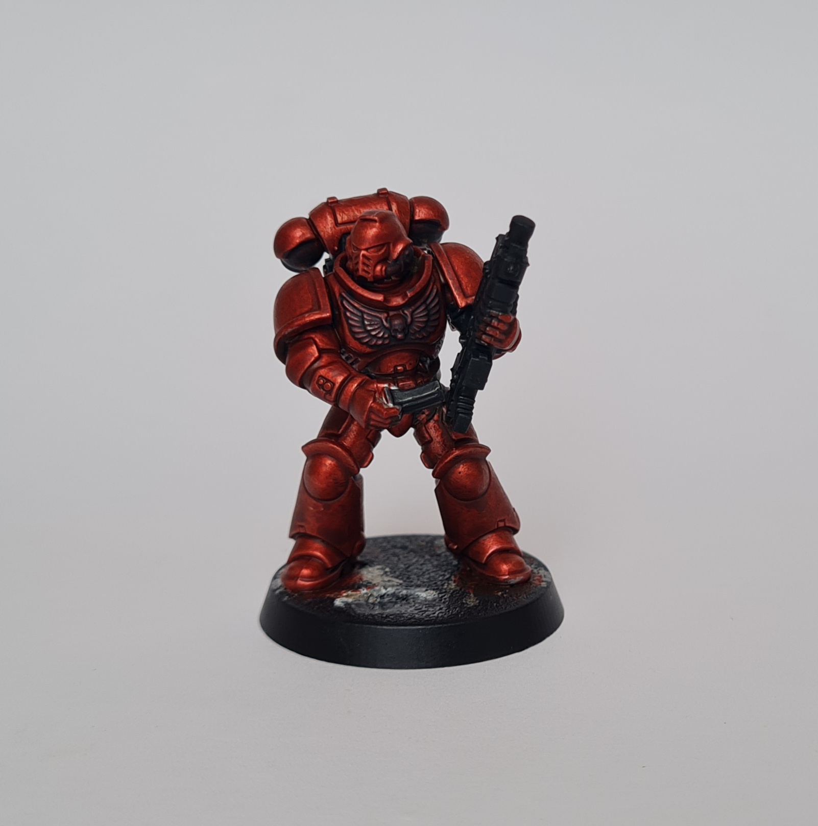
The final test model, which was painted concurrently with one more model that I’ll show at the very end, was a Blood Angel. Basically, I liked the metallic red, I’d looked back over a lot of Migsula’s Blood Angels (mostly for the ‘noble Astartes’ aspect, but always appreciating the paint job), and I thought I’d give this a go and see what I could do with it.
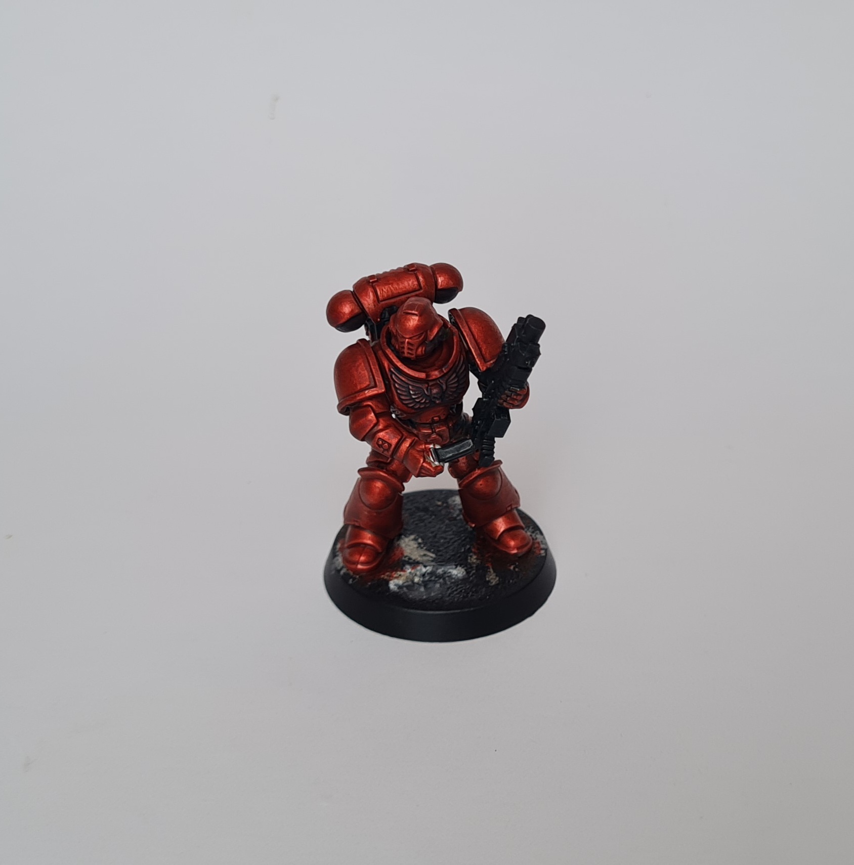
There’s a lot to like with this scheme. It’s just so bright and eye catching, you know that it will show up well on the gaming table (and ‘as a gaming piece’ is a powerful driver here, more below). However, something about this just feels a bit wrong to me. Maybe it’s because of the stupid term ‘slapchop’ which I’ve seen around. Basically, I spend some time getting the stippling base coat just right (same as above, True Brass and Shining Silver), then apply Contrast Blood Angels Red and voila. I know there’s a lot more to it, and before I judge it I should probably go back in and finish this model, taking my time with chipping and other details. As I said, I did this concurrently with another model (which the title gives away), and I think if I had more of a personal connection with the Blood Angels I’d be happy to work on this scheme. But, as is the focus of this entry, I’ve ended up going with something that I do feel more of an affinity for.
My views on Astartes
At the heart of this post is the idea that over the last few years I’ve really re-developed and refined my viewpoint and vision of Space Marines and I want to capture this with an army. I didn’t really get into Space Marines when I first got into Warhammer, though I enjoyed reading a few of their stories in WD articles and did like some of the models (the ‘new’ Rhino and then Predator kits coming out in the early 2000s coincided with my start in the hobby). Then when I got back into Warhammer with 40k in 2016 I somehow started with Tau, and Space Marines were the ‘too good’ poster army. Then as I discovered the more Grimdark view of 40k they became the brainwashed child-soldiers of the facist Imperium. Now I’ve come around to seeing them as somewhere in between, or perhaps all of, these things: they have elements that are heroic and noble, yet are inherently tragic. I’ve come to appreciate their baroque armour, antique suits of power armour that they wear with a price and don’t fully understand. They have individuality, flaws, and brotherhood. All of this comes together in a few ways:
Baroque aesthetic
Perhaps the most powerful influence on my view of the Astartes is the idea of them as baroque warriors. Their armour is truly ancient, devised and in many cases built during a time of wonder that is barely understood. It is futuristic and ancient at the same time. It’s also massive, physically imposing and more like a statue than a suit of metal armour, yet often adorned with intricate art work or reliefs. The idea of reliefs, idols and scripture plays an important part in the aesthetic which I’ve come to really appreciate, and has driven a minor interest in religious art for me.
The Horus Heresy, both the few books I’ve read, and mostly the models and Age of Darkness rulebook show a characterful and noble side of the Astartes. The Horus Heresy as a game leans heavily towards ‘historical’, with a focus on things like unit markings and other identifiers which I’d previously overlooked. There are strong features like back banners and crest-plume helmets that give a sense of Legion organisation, but they also make each Astartes an individual.
The baroque aesthetic was something I came around to gradually while looking at Migsula’s Blood Angel project. I’d loved Migsula’s previous Alpha Legion project with it’s realistic, gritty colours. It was exactly what I expected the Alpha Legion to look like. When I saw the Blood Angels - candy red and with themes of gold, richness, and religious undertones - I was surprised and disappointed. It didn’t fit with my image of Space Marines. But as time went on I realised these aspects were entirely within the realm and the art, and it was a lack of understanding on my part. I’ve studied the Blood Angels project very closely and let it inform both my view of the Astartes and what I want my painting to look like.
My experience with Space Marines
I’d already copied Migsula’s Alpha Legion (copied isn’t quite the right word - I wanted to paint Alpha Legion, there was a clear blue-print for what they could look like, so I used that and painted them in my own style using techniques I was learning from a range of sources). That was done with Ultramarines, but I struggled with trying to walk the line between Alpha Legion and Ultramarines. In doing so I didn’t really hit either of the things I wanted:
As Alpha Legion they didn’t have cultists, something I saw as a key narrative element. While they did cover the ‘sneaky operatives’ aspect on the table-top, they weren’t much of a functional gaming army. The most powerful aspect of the army was my unit of Hellblasters, who were entirely off the mark in terms of the Alpha Legion.
As Ultramarines they didn’t have things I (even back then) associated with Space Marines: no unit markings (because the Alpha Legion don’t use them), few close combat options, no terminators, only a single vehicle for most of the project (the last thing I added was a Redemptor Dreadnaught in ~ July 2023).
The army also suffered from inconsistent theming: the base of the army was from the 2018/2019 launch box models, which included Infiltrators, Eliminators, and other Phobos marines (suiting the Alpha Legion theme) and some later launch box models like the Gravis Captain, Assault Intercessors, Blade Guard (elements of Knights in armour), and Suppressors and Inceptors (bulky, futuristic fliers). Those represented three distinct visuals, though I didn’t realise it at the time (and don’t think that was really my fault, since GW seemed to be going through a crisis of identity with the release of the Primaris Marines).
By late in 2024 I knew I’d missed the mark with that army and knew that at some point, I wanted to do a Space Marine army that made use of things like unit markings and had a clear internal command structure. I knew I wanted to include the baroque aesthetic and paint to a high quality, which included finishing all the details like eye lenses and leather pouches (which I was very guilty of overlooking in the past).
Early impressions
One of the numerous collections I have saved on Instagram I’ve named “Space Marine Classic” - the pipedream that at some point I’ll paint a Space Marine army using firstborn models from around GW’s 3rd edition/early 2000’s. This is mostly inspired by my constant re-reading of White Dwarf magazines from around that time. These are two examples:
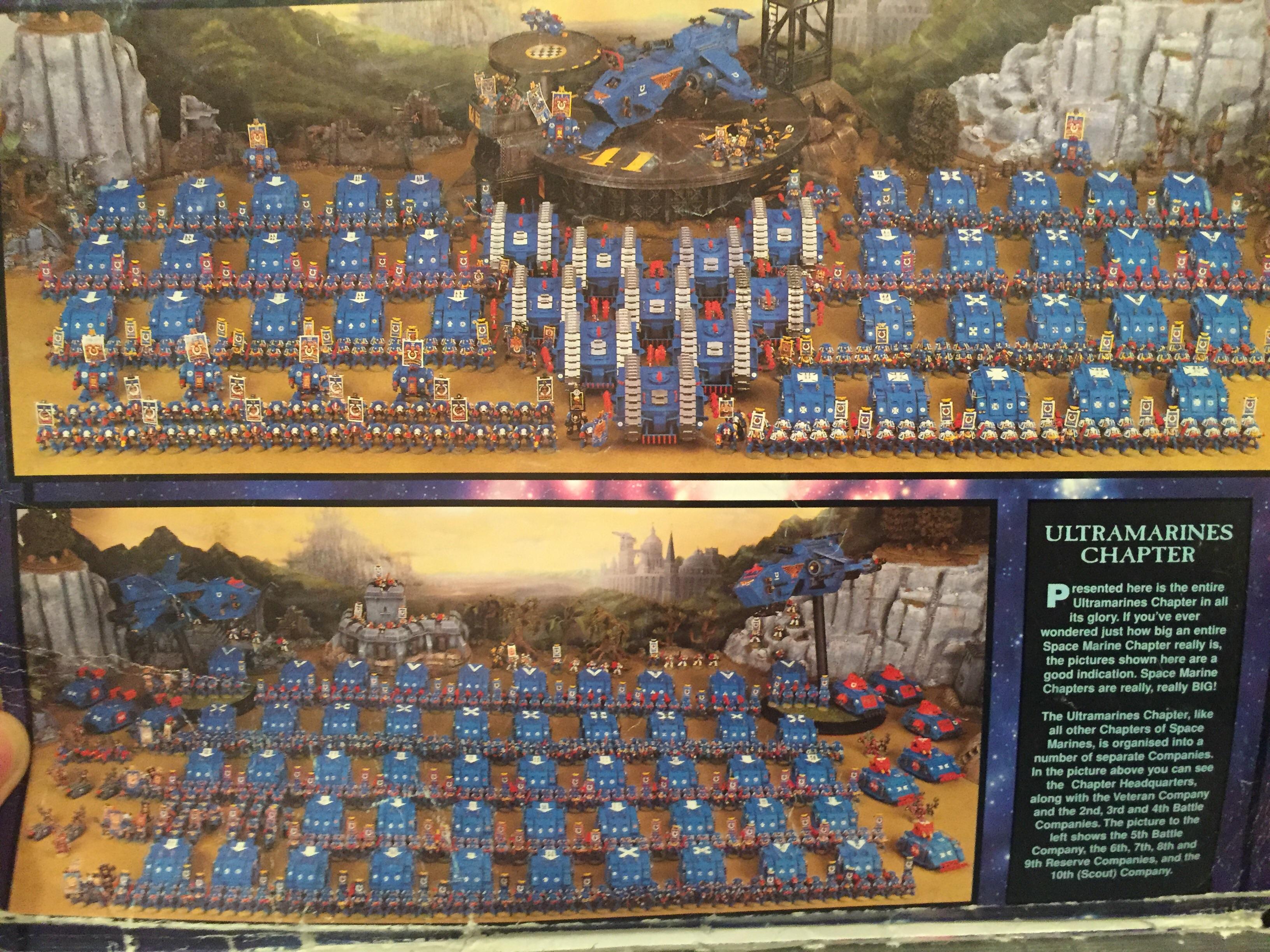
I think I must have seen this image, or something like it, on one of my first ever visits to a store that sold Warhammer. Or maybe I saw it in a book that someone had at school. I don’t know, but that blue, red and white, all massed together, is a strongly nostalgic image.
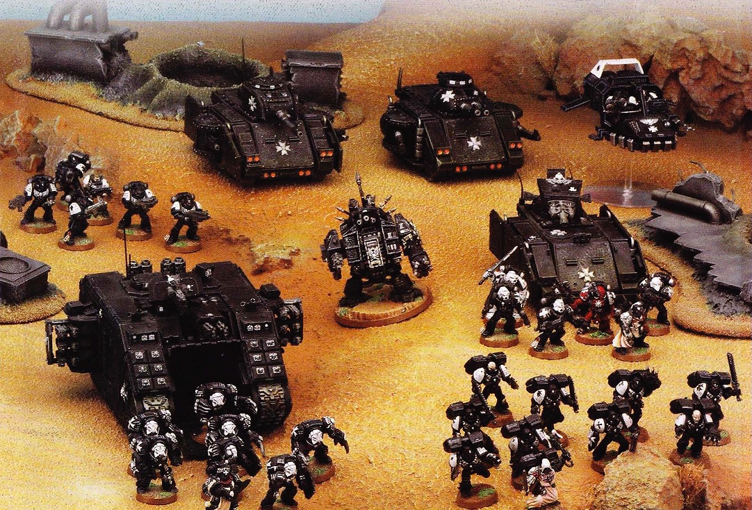
In the first WD I owned there was an early article about a hobbyist’s experience collecting Black Templars. At the time I owned some Warhammer Fantasy (having bought the 6th Edition Starter Box). Warhammer 40k, and Space Marines in general, were a mystery to me. I remember the article discussing the process of collecting the miniatures during a time before there was much lore for the Black Templars, and assembling most of the models with boltguns. When new lore came out describing them as more combat focused, the hobbyist clipped off the boltgun arms and swapped them for chainswords. There was a lot to really enjoy in that article, including an amazing group shot of the models (including a converted dreadnaught) and, what I later realised was actually a photo of Graham Davies’ Black Legion.
There is a clear and iconic theme here for me (although I struggle to define it in words). There’s a strong sense of cohesion which I attribute partially to the simple colour schemes and partially to the smaller model size - everything looks like a clear army. Something I’ve discussed with a fellow gamer and hobbyist is the importance of making our armies look like armies, with plenty of infantry, elites, some stand-out HQs, and vehicles, and I think this is definitely achieved in these earlier Space Marine armies.
So, how do I achieve that coherency and invoke the sense of “Space Marine Classic”, while also having the individual, noble, baroque look of modern Astartes models?
Black Templars
The key theme I keep returning to is the importance of picking something I have a sense of attachment to. There were really only three options among the loyalists: First, the Salamanders. They were covered in an Index Astartes, so I knew about Vulkan, I loved the art work which showed their armour as this rich, warm, yellow-green. I loved the idea of gold trim and really playing into their themes of artifice (after all, this is an art project, I’m physically building, painting, crafting these things). Second, Ultramarines. More than any other they have the clear themes of coherency, with a striking colour scheme that I think I could work with. But other than a few pieces of art, I’m not into the lore (and in fact, they are a bitter enemy of the Alpha Legion). That left the Black Templars.
I knew a bit about the Black Templars from a few WD articles: the collecting article described above, and a battle report against Orks in the desert. I knew they are close combat oriented (a plus), are descendants of Imperial Fists, and have a strong affiliation with religous artifacts and symbols. I was confident I could paint them in a scheme using black armour like what I’d used for my Chaos Knights for Warhammer Fantasy. I really enjoyed painting these models and thought I could easily transport that scheme onto the Black Templars. During some reading and research I came across the Cult of Paint series on the Black Templars Army project, and I was really inspired by the available collection of models focused on the Black Templars. I decided there was enough going in the direction of Black Templars that I would just go for it and see how it felt - a bit risky, but at the end of the day if I just painted a single unit it wasn’t too much of a commitment. Friday after work I ordered a Black Templar Crusader squad from my local games store. That evening I worked on a test model for the scheme using an Intercessor.
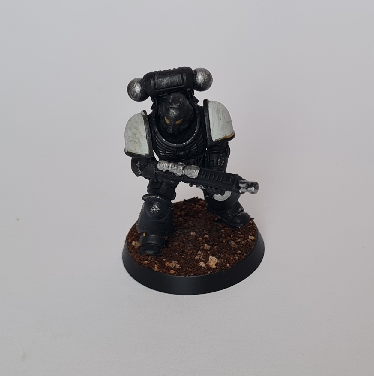
At this point, I felt I had made a grave mistake. I could not get the colour scheme working how I wanted (partially because it required a dark grey and then a dark metal, which I didn’t have). I couldn’t get the right amount of definition onto the face plate, and it wasn’t the type of place I wanted to add battle damage, so it had the opposite effect of drawing the eye to the head/face. I went to bed Friday night with a bit of regret. But, since I’d ordered this box I figured I needed to perservere here. I knew I could try some other things in terms of painting black armour if required, so I carried on. This is where the model stands as of now:
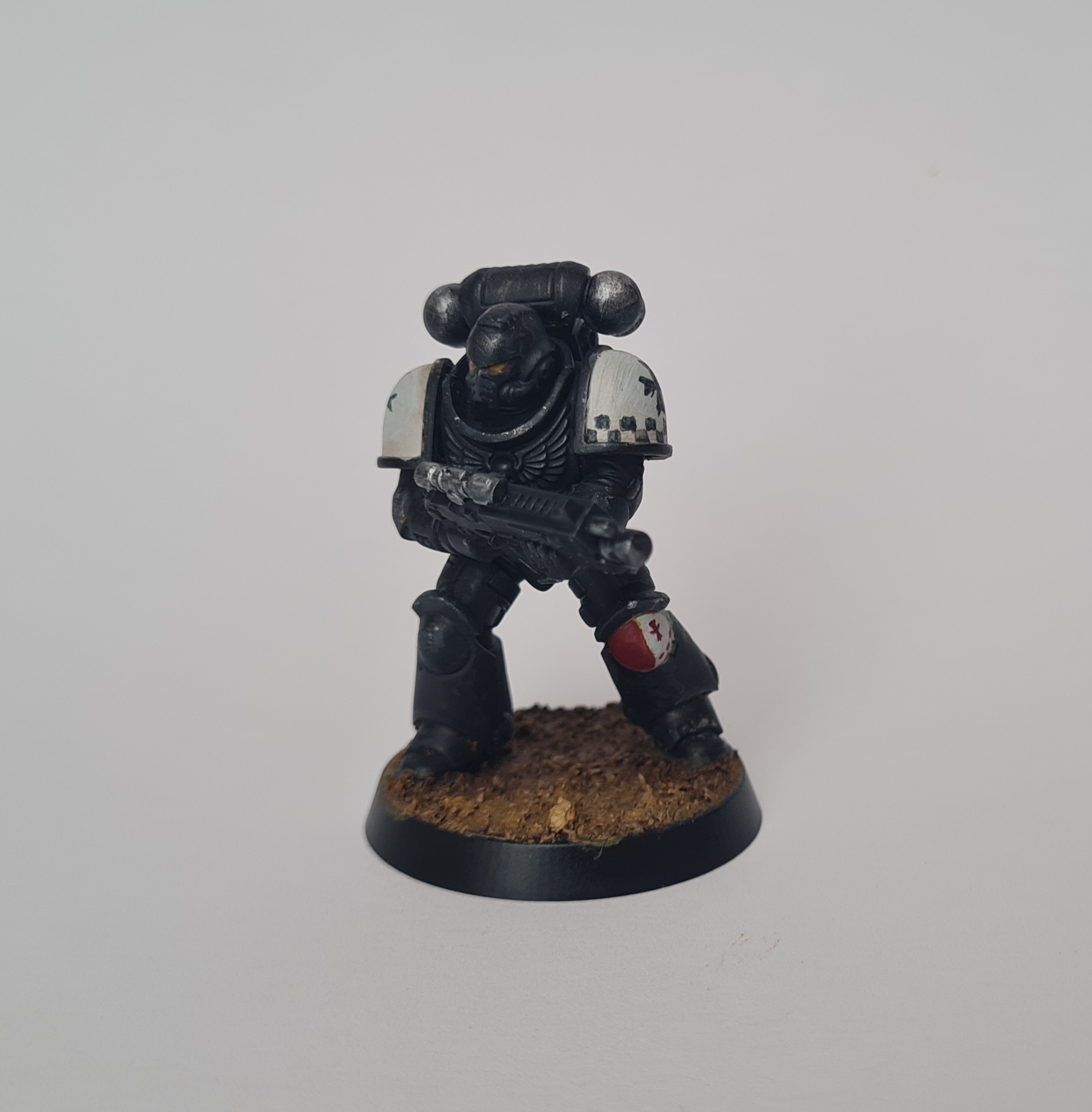
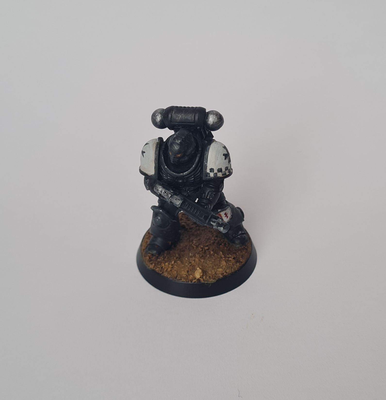

I like this a lot more. The templar imagery on the shoulder pads helps, I enjoyed doing the checkers, I like the yellow eyes, and I originally had the knee pad in half yellow (but added a too-large red circle within the yellow half, which made it look like an awkward smiley face). The black metal has worked out ok, and with more time and effort (and a dark grey and metal) I think it will work. I’ve added Contrast Guilliman Flesh as a recess wash on lots of the armour panels to give warmth and visual interest, which I’ll continue to build up until I’m happy with it. The shoulder pads are a little rough, with diluted Contrast Guilliman Flesh as shading. I’m happier with the model in-person than in the photos, and when seen from a distance I think the effect is better:
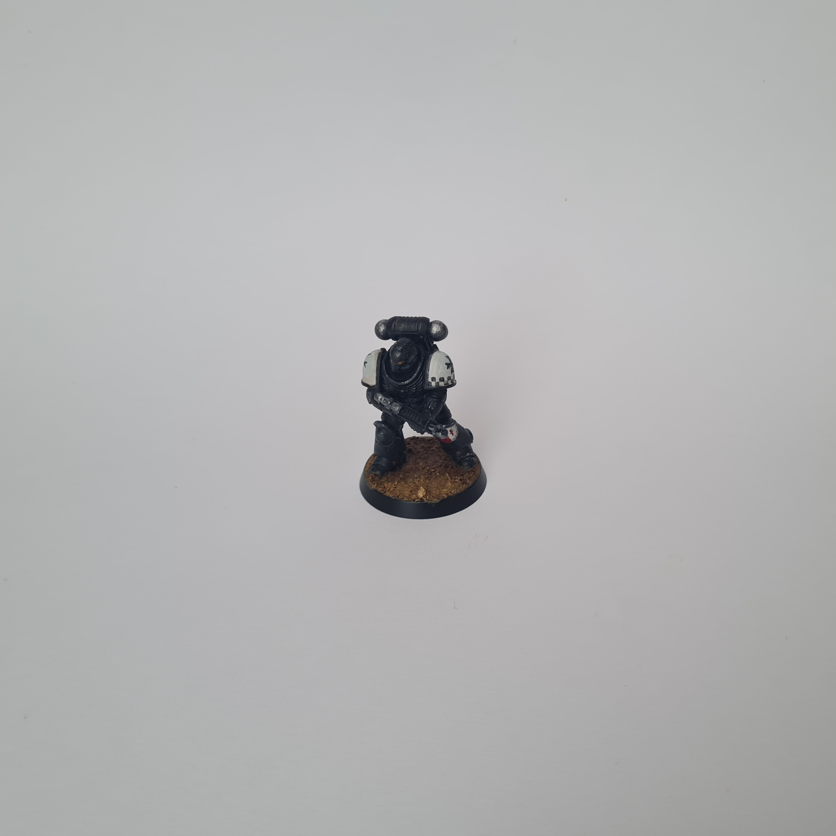
I think this has the potential to be really cohesive, properly invoking the Space Marine Classic feeling. Simultaneously, there’s space for individuality in iconography, and I can go quite deep on the detailing of the armour. I’m keen to really work on details like the eye lenses, leather belts and purity seals.
Project aims and scope
Assuming I don’t hate painting the Crusader squad, I’ll aim to make this my 40k slow-grow army that hits ~2k points in time for 11th Edition to drop in Summer 2026 (roughly nine months away). I want to take advantage of some of the things I’ve realised recently about what I think an army should look like, what a project should entail, choose the right models, and set some clear goals.
An army
I want an army that has a good core of infantry, some powerful elite units, strong HQs, and some vehicles. In short, I want to use the Force Organisation chart as a guide. It should look cohesive, and as a painting project it should also have both repetition (to establish the visual theme) and should break from this repetition (to identify key units and features).
A project
Linking this to the above block, I will aim for e.g., two core troops choices, one each of some elites (probably Sword Brethren and Terminators), some fast attack (Bikes or jump pack assault marines), and vehicles (both as troop carriers and key pieces like Dreadnaughts). I will plan out a rough list and then give myself some clear guidelines on what the project entails: I’ve realised how much I benefit from having an overview and a contained list of things to do.
Since two troops, two elites, two fast attack, three vehicles and HQ choices to lead them is already a big project, I’ll break this down further into smaller groups. Maybe something like combat patrol > 1,000 points > 2,000 points?
Also, I love the idea of adding on extra small units that might not really fit within the rules, but make sense from a project/narrative/lore aspect. Adding a unit of Sisters of Battle and/or an Inquisitor retinue, or other humans is something I’d really like to do.
Choosing models
I’ve started with the Crusader squad because I know it will give me some extra bits that fit the theme of the army. After that I will make careful choices about the models I buy, doing some visual design work to make sure everything fits within the theme. I will not be afraid to reach out to models from Heresy or other chapters (certainly some of the Dark Angels could be appropriate).
Conclusions
From the time of writing this conclusion it’s been around two weeks since I started assembling the models that became my test paintings. Between then and now I’ve scratched the itch to paint power armour, experimented with and put aside some ideas that I’ve wanted to try out, and finally managed to put into words all the thoughts I’ve been having about Space Marines.
Looking at the Black Templar test model again I have a sense that I’ve come back around to something - back to that original White Dwarf magazine with the article about collecting Black Templars and how it made me feel as a young person just getting into this hobby. I’m going to do my best to focus on that feeling of collecting, and at the same time I’m going to be consolidating all the hobby skills I’ve learned, taking my time and enjoying the painting process.